How to use PHPStorm to debug a Laravel Project
The system has already been deployed to my customer since 2015. The system still works very well. But sometimes I still receive my customer call. I need to restore database …
Technical sharing by programmers
The system has already been deployed to my customer since 2015. The system still works very well. But sometimes I still receive my customer call. I need to restore database …
類似 ChatGPT,但可以在你的電腦上運行 這篇文章將教你如何在自己的電腦上建立 本地 LLM 推理環境,使用 Ollama 離線運行大型語言模型。 第一步下載程式 請到網址 https://www.ollama.com/ 下載程式OllamaSetup.exe,並運行程式安裝到你的系統 執行程式 用滑鼠點選系統工具列上的Windows圖示,再到搜尋選單輸入Ollama,你就會看到這個Ollama程式了。請執行它。 下載模型 程式執行後,你先到下圖所示的位置選取所要用的模型,選定模型後可以按下載。 如果沒選取模型後沒有下載,詢問問題後也會下載。 詢問問題 模型的差異 在Ollama的官網上的Models中就可以看到目前Ollama可以用的模型。 像是對岸的deepseek OpenAI的開源模型 現在你已經完成 本地 LLM 推理環境 的搭建,可以開始離線實驗屬於你的 AI 模型。 子五乙的同學可以下載到你的電腦玩看看!
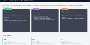
🧭 Introduction: Why Modal? Traditionally, deploying AI models in the cloud is a painful process: Modal completely changes that.It lets you define your infrastructure as code — in pure Python.You …
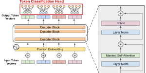
PyTorch-based LLaMA model architecture The overall architecture of the LLaMA model Waht embed_tokens does Suppose your vocabulary has only 5 words: [“I”, “want”, “to”, “learn”, “English”], Instead of representing them …

(Base → Refiner 粗生成到細化修飾流程)是一種「粗生成 → 細化修飾」的方法,使用 Stable Diffusion XL 生成潛空間影像,再由 Refiner 模型細化紋理與光影,提升影像品質與真實感。 ⚙️ 關鍵參數與流程說明 1️⃣ Base 模型:兩階段擴散模型的粗生成步驟 這裡: → 目的:產生一張粗略但有整體構圖的潛在影像。 2️⃣ Refiner 模型:兩階段擴散模型的細化修飾步驟 這裡: → 目的:讓影像更細膩、真實、視覺品質更高。 🧩 為什麼要分兩階段? 這樣做的理由主要有三個: 🔍 …

Writing meeting minutes has always been a time-consuming task. Thanks to advances in AI, we can now automate the process: In this post, we’ll walk through the full workflow. Step …
Introduction In this large language model Colab tutorial, I’ll walk you through how to efficiently load and run multiple large language models (LLMs) in Hugging Face Transformers using 4-bit quantization …
![How to Run Hugging Face Models on Google Colab [Step-by-Step Guide]](https://blog.winerva.com/wp-content/uploads/2025/09/Screenshot-2025-09-18-105913-300x150.png)
Hugging Face provides a wide variety of pre-trained models for tasks like text generation, summarization, translation, and more. Google Colab, on the other hand, offers free cloud-based Jupyter notebooks with …
Introduction Mention that this blog demonstrates how to build a chatbot that can respond with text, speech, and images while remembering conversation context. Briefly introduce Agentic AI: LLMs that can …
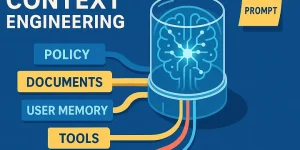
Extending OpenAI with External Tools When working with OpenAI models, you might face situations where the model cannot directly provide real-time or domain-specific answers — such as looking up the …