KK音標
video 17 母音: 3個雙母音 + 14個母音 24 …
Technical sharing by programmers
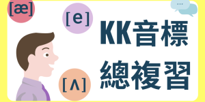
video 17 母音: 3個雙母音 + 14個母音 24 …

Build Docker Environment I wan …
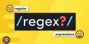
It be used for describing and …
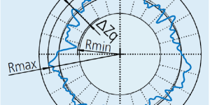
The O-ring is a circular gaske …
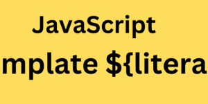
In ES6 and later, strings lite …
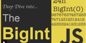
Not-a-number, NaN Binary float …
☺ Whitespace & Line Breaks …
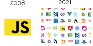
Javascript not only a script l …
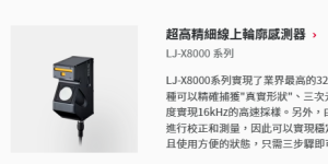
架設方式∶搭配單軸移動平台,透過Encoder送出觸發訊號給 …

🔹 Next.js 14 官方建議的方式 你可以在 src/ …