🔍common device resolutions
| Prefix | Min Width | CSS |
|---|---|---|
sm | 40rem (640px) | @media (width >= 40rem) { ... } |
md | 48rem (768px) | @media (width >= 48rem) { ... } |
lg | 64rem (1024px) | @media (width >= 64rem) { ... } |
xl | 80rem (1280px) | @media (width >= 80rem) { ... } |
2xl | 96rem (1536px) | @media (width >= 96rem) { ... } |
🔍Unit Conversion and Comparison
| Unit | Type | Description | Equivalent / Conversion Example |
|---|---|---|---|
px | Absolute | Fixed pixel size. Doesn’t change with context. | 1 px is always equal to 1 pixel. |
em | Relative | Relative to the parent’s font size. | If the parent font size is 16px, 1em equals 16px. |
rem | Relative | Relative to the root font size (<html>). | If the root font size is 16px, 1rem equals 16px. |
% | Relative | Percentage of the parent element’s size. | 50% of a parent element’s width means half the width of that element. |
fr | Relative | Fraction of available space in a grid container. | In a grid with grid-template-columns: 1fr 2fr, the second column will take twice the space of the first. |
vw | Relative | 1% of the viewport’s width. | If the viewport width is 1000px, 1vw = 10px (1% of 1000px). |
vh | Relative | 1% of the viewport’s height. | If the viewport height is 800px, 1vh = 8px (1% of 800px). |
vmin | Relative | 1% of the smaller of the viewport’s width or height. | If the viewport is 1200px wide and 800px tall, 1vmin = 8px (1% of the smaller dimension). |
vmax | Relative | 1% of the larger of the viewport’s width or height. | If the viewport is 1200px wide and 800px tall, 1vmax = 12px (1% of the larger dimension). |
ch | Relative | Width of the “0” character in the current font. | In a font where “0” is 8px wide, 1ch = 8px. |
ex | Relative | Height of the letter “x” in the current font. | In a font where “x” is 6px tall, 1ex = 6px. |
calc() | Dynamic | Allows calculations with multiple units. | calc(100% - 20px) results in 80% of the parent width minus 20px. |
🔍Key Conversion Insights
- Relative Units (
em,rem,vw,vh,fr)
These units depend on the context or parent element, so their value changes accordingly:remandemare based on font size (root forrem, parent forem).vwandvhare based on the viewport size, so they are responsive to the browser window.fris used in CSS Grid to distribute space within grid containers, and its actual size depends on the available space.
- Viewport Units (
vw,vh,vmin,vmax)
These are great for making elements responsive:vwandvhallow you to create flexible layouts based on the browser’s size.vminandvmaxautomatically adjust based on the smaller or larger dimension of the viewport.
- Absolute Units (
px,ch,ex)
These units have fixed values, making them useful when you need exact pixel sizes or character-based widths:pxis the most common fixed unit, used when precise pixel-based measurements are needed.chandexare based on the current font and can vary depending on the font style used.
🔍Practical Tips on Conversion:
- From
pxtoemorrem:
Sinceemandremare relative to font size, you can convertpxtoemorremby dividing the pixel value by the root or parent font size.
For example, if the root font size is16px, then32pxis2rem(32px ÷ 16px = 2rem). - From
vw/vhtopx:
To convertvworvhtopx, multiply the viewport size by the desired percentage.
For example, if the viewport is1000pxwide and you want to convert50vwtopx, it would be1000px × 50% = 500px. - Using
calc()for mixed units:
Thecalc()function is useful when you want to mix different units together.
For example,calc(100% - 50px)will subtract50pxfrom the full width of the parent element.
🔍Conclusion:
By understanding the differences and conversions between these units, you can make your web designs more dynamic, flexible, and responsive. Whether you’re designing for specific screen sizes, font scaling, or grid layouts, choosing the right unit is key for a successful layout. 🚀
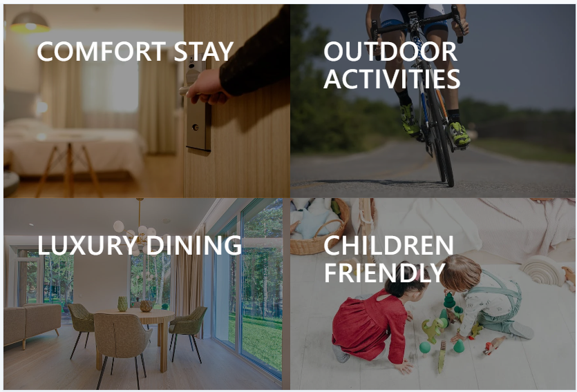
<div class="container min-h-screen grid grid-cols-2">
  <div class="item">
    <a href="#">Comfort Stay</a>
  </div>
  <div class="item">
    <a href="#">Outdoor Activities</a>
  </div>
  <div class="item">
    <a href="#">Luxury Dining</a>
  </div>
  <div class="item">
    <a href="#">Children Friendly</a>
  </div>
</div>
grid and grid-cols-2 make each item occupies 50% width and all items add up the the entrie vertical space (min-h-screen)
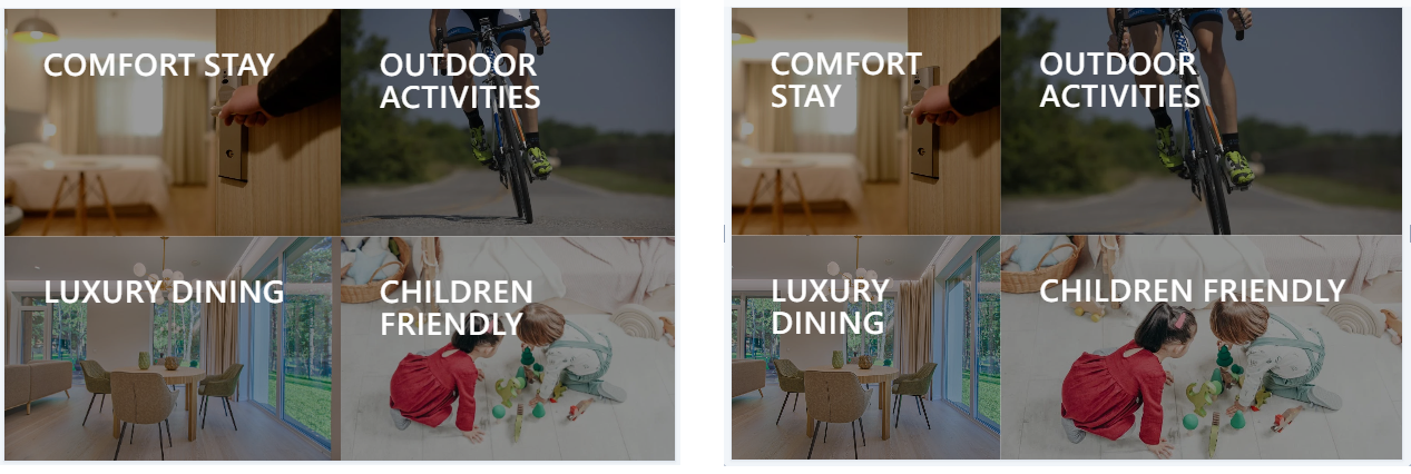
<div class="container min-h-screen grid grid-cols-[40%,60%]">
  <div class="item">
    <a href="#">Comfort Stay</a>
  </div>
  <div class="item">
    <a href="#">Outdoor Activities</a>
  </div>
  <div class="item">
    <a href="#">Luxury Dining</a>
  </div>
  <div class="item">
    <a href="#">Children Friendly</a>
  </div>
</div>
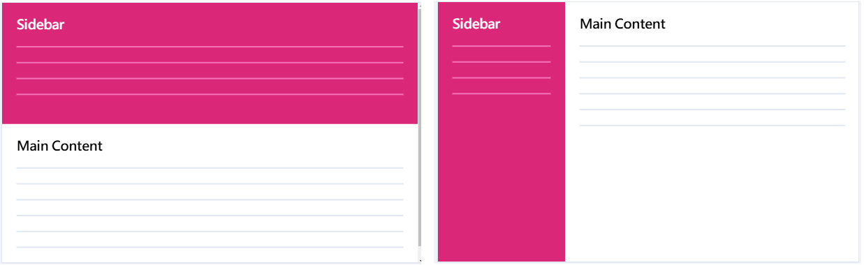
<div class="container min-h-screen grid grid-cols-[22rem,1fr]">
  <div class="sidebar">
    <h1>Sidebar</h1>
    <ul>
      <li></li>
      <li></li>
      <li></li>
      <li></li>
    </ul>
  </div>
  <div class="main">
    <h1>Main Content</h1>
    <p></p>
    <p></p>
    <p></p>
    <p></p>
    <p></p>
    <p></p>
  </div>
</div>
The fr is short for fraction representing fraction of the remaining space
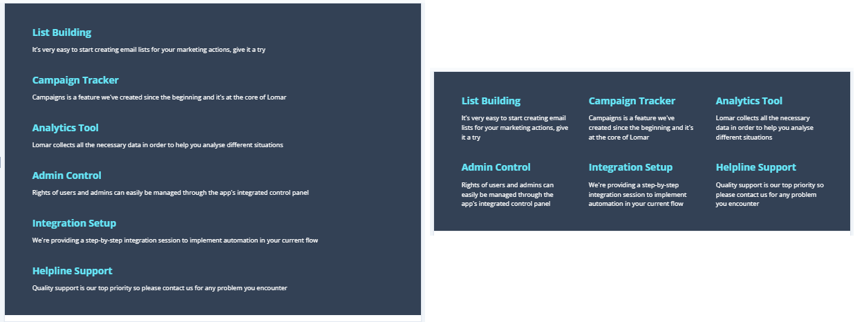
<div class="wrapper">
  <div class="container grid grid-cols-3">
    <div class="item">
      <h2>List Building</h2>
      <p>It's very easy to start creating email lists for your marketing actions, give it a try</p>
    </div>
    <div class="item">
      <h2>Campaign Tracker</h2>
      <p>Campaigns is a feature we've created since the beginning and it's at the core of Lomar</p>
    </div>
    <div class="item">
      <h2>Analytics Tool</h2>
      <p>Lomar collects all the necessary data in order to help you analyse different situations</p>
    </div>
    <div class="item">
      <h2>Admin Control</h2>
      <p>Rights of users and admins can easily be managed through the app's integrated control panel</p>
    </div>
    <div class="item">
      <h2>Integration Setup</h2>
      <p>We're providing a step-by-step integration session to implement automation in your current flow</p>
    </div>
    <div class="item">
      <h2>Helpline Support</h2>
      <p>Quality support is our top priority so please contact us for any problem you encounter</p>
    </div>
  </div>
</div>
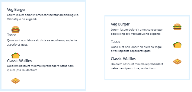
<div class="container grid grid-cols-[1fr,auto]">
  <div class="item">
    <h3>Veg Burger</h3>
    <p>Lorem ipsum dolor sit amet consectetur adipisicing elit. Velit atque hic eligendi</p>
  </div>
  <span class="icon"> 🍔 </span>
  <div class="item">
    <h3>Tacos</h3>
    <p>Quos sunt non labore ab dicta ea sequi error, sapiente asperiores quas.</p>
  </div>
  <span class="icon"> 🌮 </span>
  <div class="item">
    <h3>Classic Waffles</h3>
    <p>Dolorem nesciunt minima reprehenderit natus nam ipsum ipsa, laudantium.</p>
  </div>
  <span class="icon"> 🧇 </span>
</div>
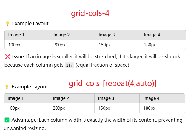
We need two columns of unequal width, so we can use grid-cols-* with arbitrary values
to specify two values separated by commas. As you might have guessed, the first value is
1fr . You can specify a fixed width for the second column. But what’s even better is to use
the keyword auto . This keyword lets the content of items decide the size of the column /
row.
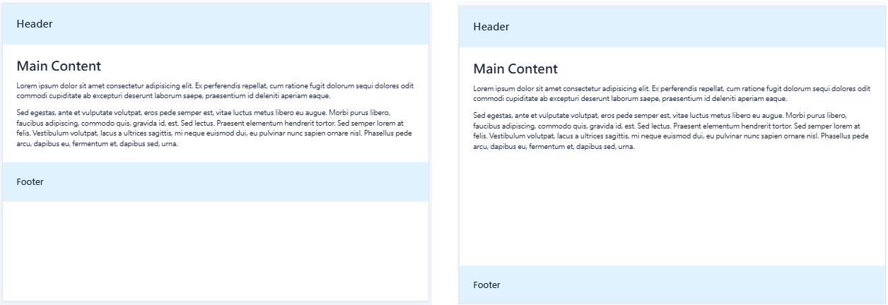
<div class="container min-h-screen grid grid-rows-[auto,1fr,auto]">
  <header>
    <h2>Header</h2>
  </header>
  <div class="main">
    <h1>Main Content</h1>
    <p>Lorem ipsum dolor sit amet consectetur adipisicing elit. Ex perferendis repellat, cum ratione fugit dolorum sequi dolores odit commodi cupiditate ab excepturi deserunt laborum saepe, praesentium id deleniti aperiam eaque.</p>
    <p>Sed egestas, ante et vulputate volutpat, eros pede semper est, vitae luctus metus libero eu augue. Morbi purus libero, faucibus adipiscing, commodo quis, gravida id, est. Sed lectus. Praesent elementum hendrerit tortor. Sed semper lorem at felis. Vestibulum volutpat, lacus a ultrices sagittis, mi neque euismod dui, eu pulvinar nunc sapien ornare nisl. Phasellus pede arcu, dapibus eu, fermentum et, dapibus sed, urna.</p>
  </div>
  <footer>
    <h3>Footer</h3>
  </footer>
</div>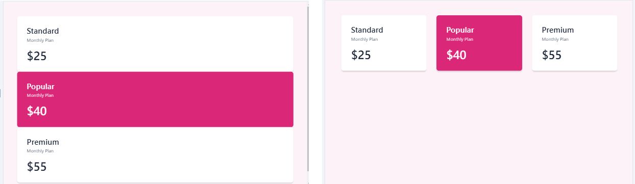
<div class="wrapper">
  <div class="container grid grid-cols-3 gap-x-8">
    <div class="plan">
      <h2>Standard</h2>
      <span>Monthly Plan</span>
      <p>$25</p>
    </div>
    <div class="plan plan-highlight">
      <h2>Popular</h2>
      <span>Monthly Plan</span>
      <p>$40</p>
    </div>
    <div class="plan">
      <h2>Premium</h2>
      <span>Monthly Plan</span>
      <p>$55</p>
    </div>
  </div>
</div>
| Tailwind Class | CSS Property & Value | Explanation |
| gap-x-0 | column-gap: 0; | Gap between columns is 0 |
| gap-x-4 | column-gap: 1rem; | Gap between columns is 1rem |
| gap-x-6 | column-gap: 1.5rem; | Gap between columns is 1.5rem |
| gap-x-8 | column-gap: 2rem; | Gap between columns is 2rem |
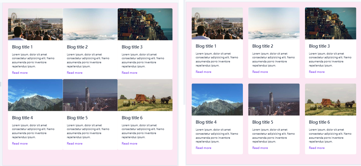
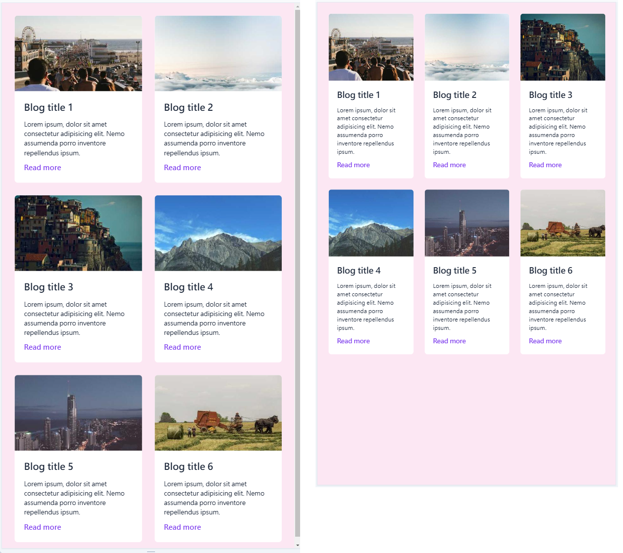
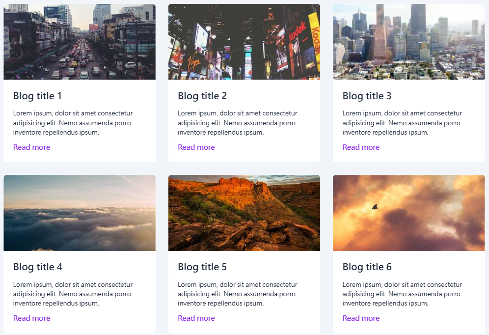
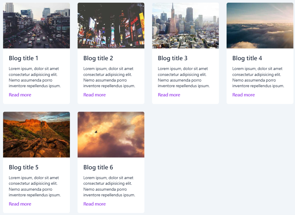
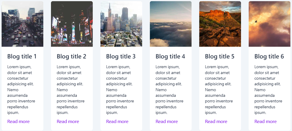
At sm breakpoint, we change that to two columns using grid-cols-2 and at md breakpoint, we change it to three columns using grid-cols-3 . We also add spacing of 2rem between columns and rows with gap-x-8 and gap-y-8 . sm is small screen, md is large screen.
<div class="container grid sm:grid-cols-2 md:grid-cols-3 gap-x-8 gap-y-8">
  <div class="item">
    <img src="https://picsum.photos/400/300" alt="" />
    <div>
      <h2>Blog title 1</h2>
      <p>Lorem ipsum, dolor sit amet consectetur adipisicing elit. Nemo assumenda porro inventore repellendus ipsum.</p>
      <a href="#">Read more</a>
    </div>
  </div>
  <div class="item">
    <img src="https://picsum.photos/400/300?1" alt="" />
    <div>
      <h2>Blog title 2</h2>
      <p>Lorem ipsum, dolor sit amet consectetur adipisicing elit. Nemo assumenda porro inventore repellendus ipsum.</p>
      <a href="#">Read more</a>
    </div>
  </div>
  <div class="item">
    <img src="https://picsum.photos/400/300?2" alt="" />
    <div class="desc">
      <h2>Blog title 3</h2>
      <p>Lorem ipsum, dolor sit amet consectetur adipisicing elit. Nemo assumenda porro inventore repellendus ipsum.</p>
      <a href="#">Read more</a>
    </div>
  </div>
  <div class="item">
    <img src="https://picsum.photos/400/300?3" alt="" />
    <div class="desc">
      <h2>Blog title 4</h2>
      <p>Lorem ipsum, dolor sit amet consectetur adipisicing elit. Nemo assumenda porro inventore repellendus ipsum.</p>
      <a href="#">Read more</a>
    </div>
  </div>
  <div class="item">
    <img src="https://picsum.photos/400/300?4" alt="" />
    <div class="desc">
      <h2>Blog title 5</h2>
      <p>Lorem ipsum, dolor sit amet consectetur adipisicing elit. Nemo assumenda porro inventore repellendus ipsum.</p>
      <a href="#">Read more</a>
    </div>
  </div>
  <div class="item">
    <img src="https://picsum.photos/400/300?5" alt="" />
    <div class="desc">
      <h2>Blog title 6</h2>
      <p>Lorem ipsum, dolor sit amet consectetur adipisicing elit. Nemo assumenda porro inventore repellendus ipsum.</p>
      <a href="#">Read more</a>
    </div>
  </div>
</div>
<div class="container grid grid-cols-4 gap-12">
  <img src="https://res.cloudinary.com/thirus/image/upload/v1634556259/logos/logoipsum-5_wqq52e.svg" alt="" />
  <img src="https://res.cloudinary.com/thirus/image/upload/v1634556262/logos/logoipsum-8_euk84k.svg" alt="" />
  <img src="https://res.cloudinary.com/thirus/image/upload/v1634556260/logos/logoipsum-1_frjjk6.svg" alt="" />
  <img src="https://res.cloudinary.com/thirus/image/upload/v1634556262/logos/logoipsum-9_hqrvx7.svg" alt="" />
  <img src="https://res.cloudinary.com/thirus/image/upload/v1634564578/logos/logoipsum-13_zvuric.svg" alt="" />
  <img src="https://res.cloudinary.com/thirus/image/upload/v1634556259/logos/logoipsum-2_gxwamm.svg" alt="" />
  <img src="https://res.cloudinary.com/thirus/image/upload/v1634564391/logos/logoipsum-11_bhrqq2.svg" alt="" />
  <img src="https://res.cloudinary.com/thirus/image/upload/v1634564391/logos/logoipsum-12_hskbxm.svg" alt="" />
</div>
<div class="container grid grid-cols-[repeat(4,auto)] gap-12">
  <img src="https://res.cloudinary.com/thirus/image/upload/v1634556259/logos/logoipsum-5_wqq52e.svg" alt="" />
  <img src="https://res.cloudinary.com/thirus/image/upload/v1634556262/logos/logoipsum-8_euk84k.svg" alt="" />
  <img src="https://res.cloudinary.com/thirus/image/upload/v1634556260/logos/logoipsum-1_frjjk6.svg" alt="" />
  <img src="https://res.cloudinary.com/thirus/image/upload/v1634556262/logos/logoipsum-9_hqrvx7.svg" alt="" />
  <img src="https://res.cloudinary.com/thirus/image/upload/v1634564578/logos/logoipsum-13_zvuric.svg" alt="" />
  <img src="https://res.cloudinary.com/thirus/image/upload/v1634556259/logos/logoipsum-2_gxwamm.svg" alt="" />
  <img src="https://res.cloudinary.com/thirus/image/upload/v1634564391/logos/logoipsum-11_bhrqq2.svg" alt="" />
  <img src="https://res.cloudinary.com/thirus/image/upload/v1634564391/logos/logoipsum-12_hskbxm.svg" alt="" />
</div>
| Tailwind | CSS Property & Value | Explanation |
| justify-start | justify-content: flex-start; | All columns are placed at the beginning of the container |
| justify-end | justify-content: flex-end; | All columns are placed at the end of the container |
| justify-center | justify-content: center; | All columns are placed at the center |
| justify-between | justify-content: space-between | All columns are spaced out as much as possible with first column at the beginning and last column at the end (We just saw this in action) |
| justify-around | justify-content: space-around; | Space before the columns and after the columns are half as much as space between the columns |
| justify-evenly | justify-content: space-evently; | Space before, after and between the columns are same |

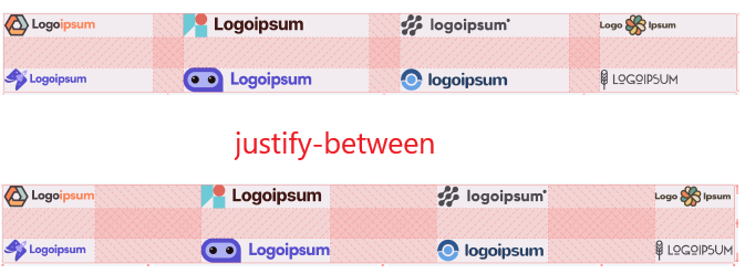
The .container div has eight child div elements. To arrange them into two rows with four columns each, use grid-cols-[repeat(4,auto)].
Next, apply gapy-* utilities to control the vertical and horizontal spacing between items. Finally, use justify-between to evenly distribute the items horizontally within the container.
<div class="container grid grid-cols-[repeat(4,auto)] gap-y-8 gap-x-4 justify-between">
  <img src="https://images.pexels.com/photos/8148587/pexels-photo-8148587.jpeg?auto=compress&cs=tinysrgb&dpr=2&h=100" alt="" />
  <div class="desc">
    <h3>Stylish Tote Bag</h3>
    <p>Brown Color Women's Tote Bag</p>
    <span>#368798</span>
  </div>
  <div>
    <label>Quantity :</label>
    <input type="text" value="1" size="1" />
  </div>
  <div class="price">$99.00</div>
  <img src="https://images.pexels.com/photos/1362558/pexels-photo-1362558.jpeg?auto=compress&cs=tinysrgb&dpr=2&h=100" alt="" />
  <div>
    <h3>Sunglasses</h3>
    <p>Glasses with wooden frame</p>
    <span>#756328</span>
  </div>
  <div>
    <label>Quantity :</label>
    <input type="text" value="1" size="1" />
  </div>
  <div class="price">$142.00</div>
</div>
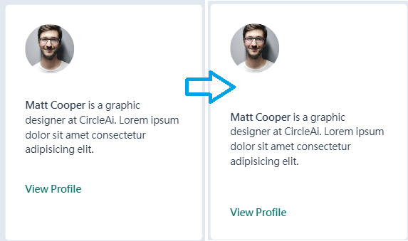
There are three child items. We use Grid utilities to define the layout and content-between to evenly distribute the items along the vertical axis.
<div class="card h-96 grid content-between">
  <img src="https://images.pexels.com/photos/220453/pexels-photo-220453.jpeg?auto=compress&cs=tinysrgb&dpr=2&w=80" alt="" />
  <p><strong>Matt Cooper</strong> is a graphic designer at CircleAi. Lorem ipsum dolor sit amet consectetur adipisicing elit.</p>
  <a href="#">View Profile</a>
</div>
In Flexbox, the content-* utilities control the spacing between multiple lines of wrapped items along the cross axis. In Grid, these utilities serve a different purpose—they control the spacing between rows.
The content-between utility, which we just used, is one of several options. These content-* utilities function similarly to justify-* utilities.
🔹 justify-*: Controls the placement of columns within the container.
🔹 content-*: Controls the placement of rows within the container.
The first step is to add the justify-between utility to distribute the items evenly along the horizontal axis. Then, apply the content-center utility to center the items vertically on the screen.
We can also combine justify-center and content-center into a single utility, place-content-center, to both horizontally and vertically center the items.
The place-content-* utilities allow you to control the spacing of grid items along both the block and inline axes simultaneously. This is useful when you want the placement of rows and columns to be the same.
<div class="container min-h-screen grid grid-cols-[repeat(4,auto)] gap-12 justify-between content-center"> //replace with place-content-center
  <img src="https://res.cloudinary.com/thirus/image/upload/v1634556259/logos/logoipsum-5_wqq52e.svg" alt="" />
  <img src="https://res.cloudinary.com/thirus/image/upload/v1634556262/logos/logoipsum-8_euk84k.svg" alt="" />
  <img src="https://res.cloudinary.com/thirus/image/upload/v1634556260/logos/logoipsum-1_frjjk6.svg" alt="" />
  <img src="https://res.cloudinary.com/thirus/image/upload/v1634556262/logos/logoipsum-9_hqrvx7.svg" alt="" />
  <img src="https://res.cloudinary.com/thirus/image/upload/v1634564578/logos/logoipsum-13_zvuric.svg" alt="" />
  <img src="https://res.cloudinary.com/thirus/image/upload/v1634556259/logos/logoipsum-2_gxwamm.svg" alt="" />
  <img src="https://res.cloudinary.com/thirus/image/upload/v1634564391/logos/logoipsum-11_bhrqq2.svg" alt="" />
  <img src="https://res.cloudinary.com/thirus/image/upload/v1634564391/logos/logoipsum-12_hskbxm.svg" alt="" />
</div>

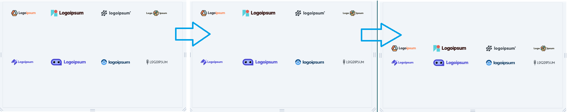
We’re back with the same example but with a new variation. Previously, all the logos were approximately the same size, which worked well. However, if you add smaller or wider logos, you’ll need to center-align them within each column.
In the link below, you can see that the wider logos increase the width of the columns, and by default, the smaller logos are aligned to the left of those columns. Use the Inspector Tool to examine what’s happening in more detail. So, how can we center the smaller logos within the columns?
As we know, CSS Grid behaves like a table with rows and columns. If you’re familiar with tables (or even spreadsheets), you know that adding more content to a cell will widen the entire column. The same thing happens here. While this occurs, the content in the other cells in that column will be left-aligned by default.
The justify-items-* utilities allow us to horizontally align content within columns, while the justify-* utilities control the spacing of entire columns.
<div class="container grid grid-cols-[repeat(4,auto)] gap-12 justify-between justify-items-center">
  <img src="https://res.cloudinary.com/thirus/image/upload/v1634556259/logos/logoipsum-5_wqq52e.svg" alt="" />
  <img src="https://res.cloudinary.com/thirus/image/upload/v1634556262/logos/logoipsum-8_euk84k.svg" alt="" />
  <img src="https://res.cloudinary.com/thirus/image/upload/v1634556259/logos/logoipsum-6_jie3be.svg" alt="" />
  <img src="https://res.cloudinary.com/thirus/image/upload/v1634556262/logos/logoipsum-9_hqrvx7.svg" alt="" />
  <img src="https://res.cloudinary.com/thirus/image/upload/v1634564578/logos/logoipsum-13_zvuric.svg" alt="" />
  <img src="https://res.cloudinary.com/thirus/image/upload/v1634556261/logos/logoipsum-7_vuiq6n.svg" alt="" />
  <img src="https://res.cloudinary.com/thirus/image/upload/v1634564391/logos/logoipsum-11_bhrqq2.svg" alt="" />
  <img src="https://res.cloudinary.com/thirus/image/upload/v1634556262/logos/logoipsum-10_pbu8et.svg" alt="" />
</div>| Tailwind Class | CSS Property & Value | Explanation |
| justify-items-start | justify-items: start; | All items are placed at the beginning of their columns (horizontally) |
| justify-items-end | justify-items: end; | All items are placed at the end of their columns (horizontally) |
| justify-items-center | justify-items: center; | All items are placed at the center of their columns (horizontally) |
| justify-items-stretch | justify-items: stretch; | The items are stretched to occupy full width of the column if possible |
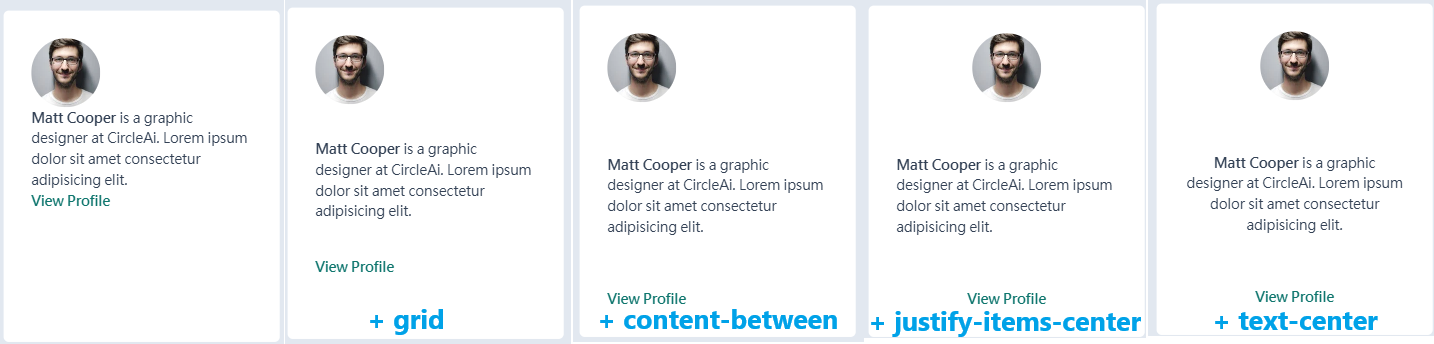
<div class="card h-96 grid content-between justify-items-center text-center">
  <img src="https://images.pexels.com/photos/220453/pexels-photo-220453.jpeg?auto=compress&cs=tinysrgb&dpr=2&w=80" alt="" />
  <p><strong>Matt Cooper</strong> is a graphic designer at CircleAi. Lorem ipsum dolor sit amet consectetur adipisicing elit.</p>
  <a href="#">View Profile</a>
</div>
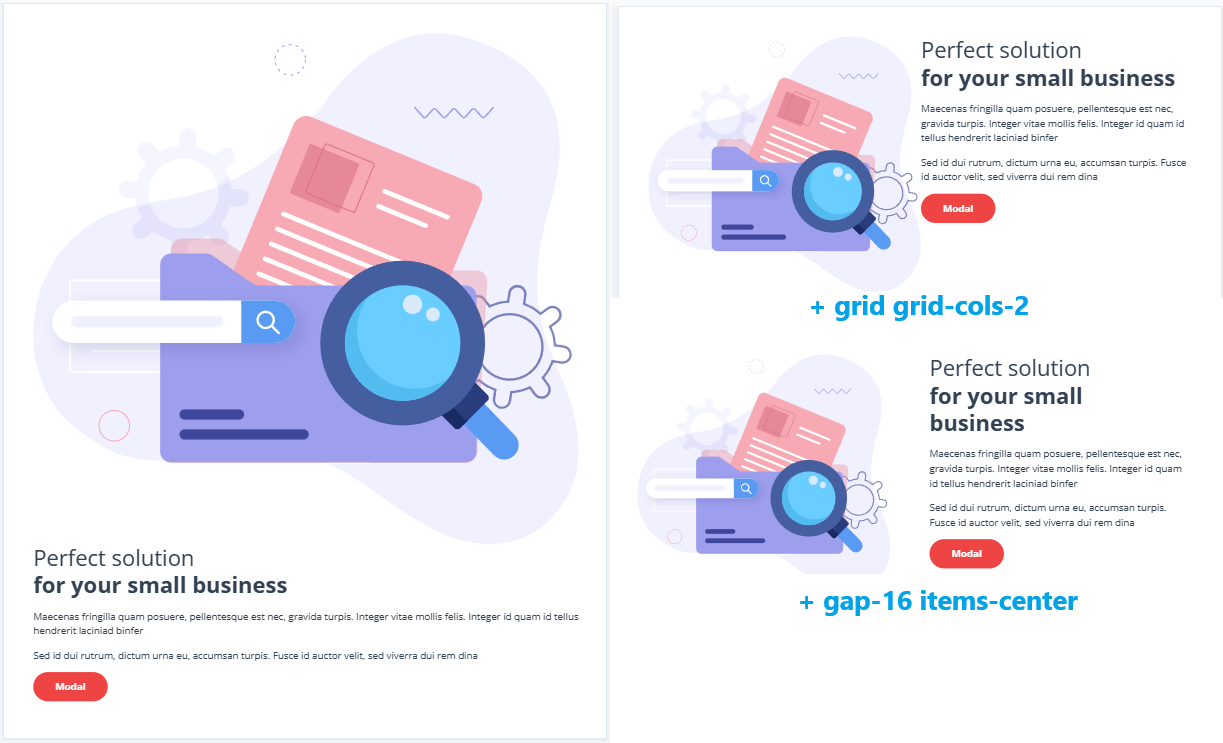
<section class="container min-h-screen grid grid-cols-2 gap-16 items-center">
  <img src="https://res.cloudinary.com/thirus/image/upload/v1634585194/images/details-1_e7ojp9.svg" alt="" />
  <div>
    <h1>
      Perfect solution<br />
      <strong>for your small business</strong>
    </h1>
    <p>Maecenas fringilla quam posuere, pellentesque est nec, gravida turpis. Integer vitae mollis felis. Integer id quam id tellus hendrerit laciniad binfer</p>
    <p>Sed id dui rutrum, dictum urna eu, accumsan turpis. Fusce id auctor velit, sed viverra dui rem dina</p>
    <button>Modal</button>
  </div>
</section>
In CSS Grid, as we observed earlier, adding more content to a single cell widens the entire column and also increases the height of the row. While this happens, all other cells in the row will have content sticking to the top of the column by default. This is why, in our previous example, when the image is taller than the text, the text aligns to the top of the row, and when the text is taller than the image, the image aligns to the top.
The items-* utilities allow us to vertically align content within rows, while the earlier content-* property lets us control the spacing of entire rows. We’ve already seen these utilities when we covered this concept in the context of Flexbox. Here they are again for reference.
| Tailwind Class | CSS Property & Value | Explanation |
| items:stretch | align-items: stretch; | All items are stretched to fill the container |
| items-center | align-items: center; | All items are aligned to the center of the container |
| items-start | align-items: flex-start; | All items are aligned to the beginning of the container (at the top in case of the above example) |
| items-end | align-items: flex-end; | All items are aligned to the end of the container (at the bottom in case of the above example) |
| items-baseline | align-items: baseline; | All items are positioned such that the base aligns to the end of the container (will we talk about this soon) |
Summary:
justify-between: Distributes the entire rows horizontally with equal spacing.justify-items-center: Centers smaller and wider logos horizontally within each column.items-center: Centers shorter and taller logos vertically within each row.
4o mini
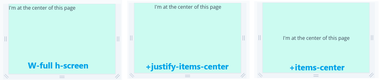
The place-items-* utilities allow you to align items both horizontally within columns and vertically within rows simultaneously. However, this only works when you want the same alignment in both directions.
In the previous example, we wanted each item to be centered both horizontally and vertically, making place-items-* the ideal choice. These utilities function similarly to justify-items-* (for horizontal alignment) and items-* (for vertical alignment).
<div class="w-full h-screen grid justify-items-center items-center">
  <div class="item">I'm at the center of this page</div>
</div>
<div class="w-full h-screen grid place-items-center">
  <div class="item">I'm at the center of this page</div>
</div>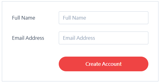
<form class="grid grid-cols-[auto,1fr] items-center gap-y-6 gap-x-12">
  <label> Full Name </label>
  <input type="text" name="name" placeholder="Full Name" />
  <label> Email Address </label>
  <input type="email" name="email" placeholder="Email Address" />
  <button type="submit" class="col-start-2">Create Account</button>
</form>
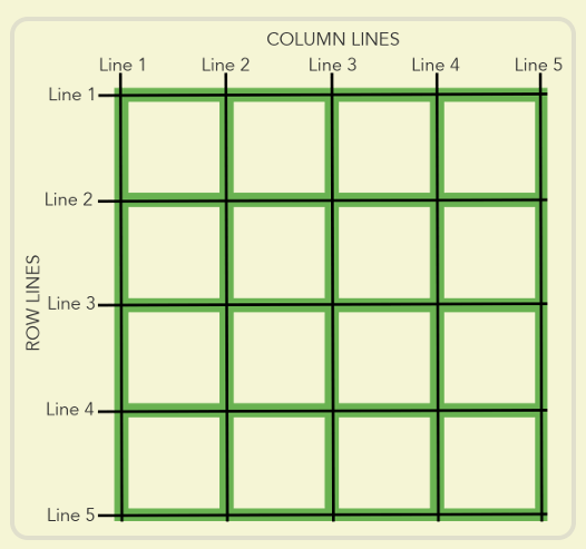
col-start-* and col-end-* : for column lines
row-start-* and row-end-*: for row lines
There are five child items. Use grid-cols-[auto,1fr] to create a two-column layout. However, the last item, the “Create Account” button, will appear in the first column of the last row by default. To place it in the second column, apply the col-start-2 utility.
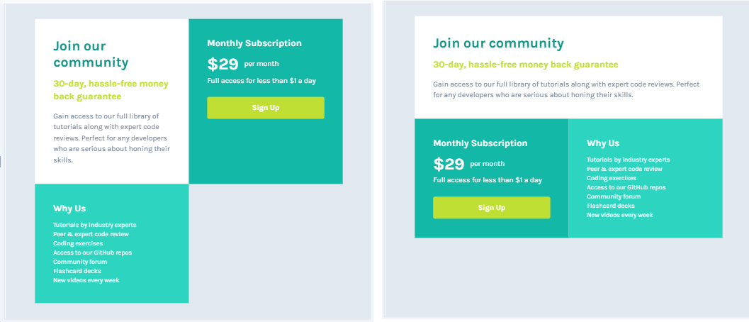
<div class="container grid grid-cols-2">
  <div class="component-header col-start-1 col-end-3">
    <h2>Join our community</h2>
    <h3>30-day, hassle-free money back guarantee</h3>
    <p>Gain access to our full library of tutorials along with expert code reviews. Perfect for any developers who are serious about honing their skills.</p>
  </div>
  <div class="subscription">
    <h3>Monthly Subscription</h3>
    <span class="price">$29</span><span class="per">per month</span>
    <p>Full access for less than $1 a day</p>
    <a href="#" id="sign-up">Sign Up</a>
  </div>
  <div class="why">
    <h3>Why Us</h3>
    <ul>
      <li>Tutorials by industry experts</li>
      <li>Peer & expert code review</li>
      <li>Coding exercises</li>
      <li>Access to our GitHub repos</li>
      <li>Community forum</li>
      <li>Flashcard decks</li>
      <li>New videos every week</li>
    </ul>
  </div>
</div>
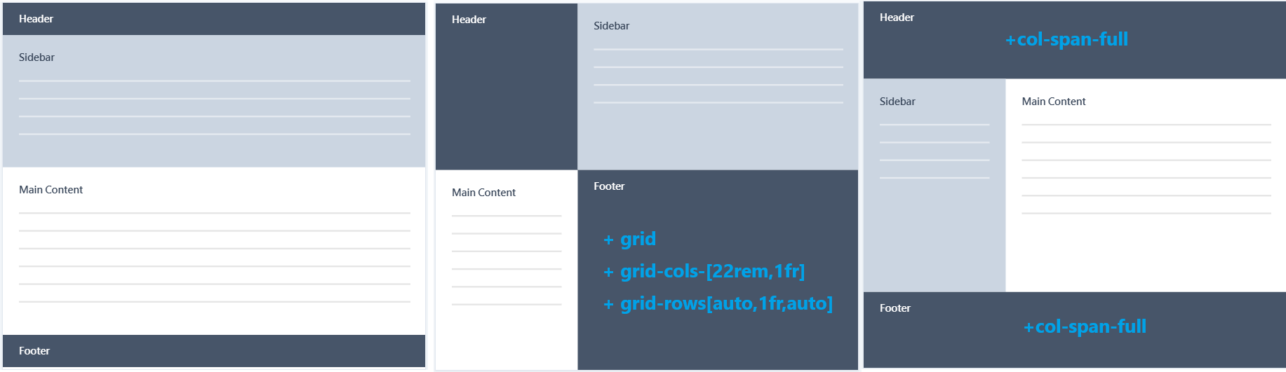
<div class="container min-h-screen grid grid-cols-[22rem,1fr] grid-rows[auto,1fr,auto]">
  <header class="col-span-full"> //it means the element will stretch across all columns in the grid.
    <h2>Header</h2>
  </header>
  <div class="sidebar">
    <h2>Sidebar</h2>
    <ul>
      <li></li>
      <li></li>
      <li></li>
      <li></li>
    </ul>
  </div>
  <div class="main">
    <h2>Main Content</h2>
    <p></p>
    <p></p>
    <p></p>
    <p></p>
    <p></p>
    <p></p>
  </div>
  <footer class="col-span-full">//it means the element will stretch across all columns in the grid.
    <h2>Footer</h2>
  </footer>
</div>
The Tailwind CSS code grid-cols-[22rem,1fr] and grid-rows-[auto,1fr,auto] are custom column and row definitions for a CSS Grid layout. Let’s break down their meaning:
🔍Columns (grid-cols-[22rem,1fr])
- This defines two columns in the grid:
- First column (
22rem): Fixed width of 22rem (typically 1rem = 16px, so 22rem = 352px). - Second column (
1fr): Takes up the remaining available space in the container, making it flexible.
- First column (
🔍Rows (grid-rows-[auto,1fr,auto])
- This defines three rows in the grid:
- First row (
auto): Automatically sized based on its content (e.g.,headerheight depends on its content). - Second row (
1fr): Takes up all the remaining available space, ensuring the main content stretches dynamically. - Third row (
auto): Also sized automatically based on its content (e.g.,footerheight adapts to its content).
- First row (
Summary
This setup ensures:
- A fixed-width sidebar (22rem) and a flexible main content area (1fr).
- A header and footer that adjust to their content, while the main content area expands to fill the remaining space.
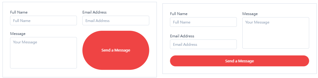
<form class="grid grid-cols-2 gap-6">
  <div>
    <label> Full Name </label>
    <input type="text" name="name" placeholder="Full Name" />
  </div>
  <div >
    <label> Email Address </label>
    <input type="email" name="email" placeholder="Email Address" />
  </div>
  <div class="col-start-2 row-start-1 row-end-3">
    <label> Message </label>
    <textarea name="message" placeholder="Your Message" rows="5"></textarea>
  </div>
  <button class="col-span-full">Send a Message</button>
</form>
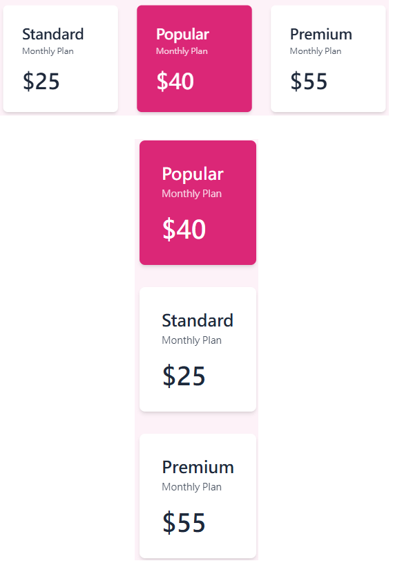
<div class="wrapper">
  <div class="container grid grid-cols-[minmax(auto,18rem)] sm:grid-cols-[repeat(3,minmax(auto,18rem))] justify-center gap-8">
    <div class="plan">
      <h2>Standard</h2>
      <span>Monthly Plan</span>
      <p>$25</p>
    </div>
    <div class="plan plan-highlight order-first sm:order-none">
      <h2>Popular</h2>
      <span>Monthly Plan</span>
      <p>$40</p>
    </div>
    <div class="plan">
      <h2>Premium</h2>
      <span>Monthly Plan</span>
      <p>$55</p>
    </div>
  </div>
</div>
🔍order-first
- Moves the element to the first position within its parent container.
- Equivalent to
order: -9999;in CSS. - Used when you want an element to always appear first.
🔍sm:order-none
- Applies
order: 0;when the screen size reaches thesmbreakpoint (640px and above by default). - This resets the order, making the element follow the natural HTML structure.
🔍 grid-cols-[minmax(auto,18rem)]
- Defines one column with a flexible width:
minmax(auto, 18rem):- The minimum width is
auto(adjusts to content). - The maximum width is
18rem(288px).
- The minimum width is
- This means:
- By default, only one column exists.
- The column’s width adapts to content but will never exceed
18rem.
🔍sm:grid-cols-[repeat(3,minmax(auto,18rem))]
- On small screens (
sm, ≥640px), the grid changes to three columns:repeat(3, minmax(auto, 18rem)):- Creates 3 columns, each flexible with a max width of
18rem. - If there’s enough space, the columns will expand up to
18rem. - If space is limited, they will shrink but still fit content (
auto).
- Creates 3 columns, each flexible with a max width of
✅ Effect:
- Mobile (default) → 1 column
- Small screens (
sm≥ 640px) → 3 columns
Columns 2: <div class=”container grid grid-cols-[repeat(auto-fit,minmax(32rem,1fr))] gap-8″>

Columns 3: <div class=”container grid grid-cols-[repeat(auto-fit,minmax(24rem,1fr))] gap-8″>
Columns 4:<div class=”container grid grid-cols-[repeat(auto-fit,minmax(16rem,1fr))] gap-8″>
Columns 6:<div class=”container grid grid-cols-[repeat(auto-fit,minmax(8rem,1fr))] gap-8″>
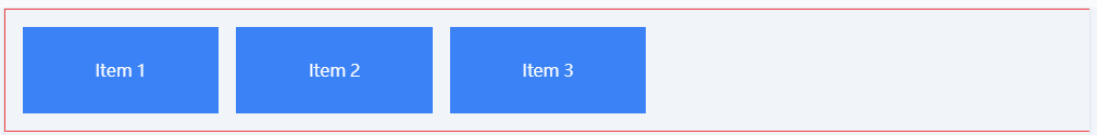
✅ Example 1: auto-fit (Shrinks to Fit)

<div class="grid grid-cols-[repeat(auto-fit,minmax(150px,1fr))] gap-4 border border-red-500 p-4">
  <div class="bg-blue-500 text-white flex items-center justify-center h-20">Item 1</div>
  <div class="bg-blue-500 text-white flex items-center justify-center h-20">Item 2</div>
  <div class="bg-blue-500 text-white flex items-center justify-center h-20">Item 3</div>
</div>
🔍 How auto-fit Works
- Fills available space by expanding items
- No extra empty columns are left
- If fewer items exist than the max grid capacity, the items stretch to fill the row
- As the container grows, the grid items will expand until a new column can fit
✅ Example 2: auto-fill (Preserves Empty Slots)
<div class="grid grid-cols-[repeat(auto-fill,minmax(150px,1fr))] gap-4 border border-red-500 p-4">
  <div class="bg-blue-500 text-white flex items-center justify-center h-20">Item 1</div>
  <div class="bg-blue-500 text-white flex items-center justify-center h-20">Item 2</div>
  <div class="bg-blue-500 text-white flex items-center justify-center h-20">Item 3</div>
</div>
🔍 How auto-fill Works
- Creates extra empty columns, even if there aren’t enough items
- Unlike
auto-fit, it does not stretch items to fill extra space - If the container has space for 5 columns but only 3 items exist, it reserves 2 empty slots
- As the container grows, empty slots remain
🎯 Key Differences
| Behavior | auto-fit | auto-fill |
|---|---|---|
| Does it shrink unused space? | ✅ Yes | ❌ No |
| When the container grows? | Items stretch to fill | Empty slots remain |
| Best used when? | You want items to always fit the row | You want to keep empty grid slots |
With this, you should have a clear understanding of auto-fit vs auto-fill in CSS Grid! 🚀
<section class="grid">
<span>11.5k</span>
<p>Tweets</p>
<span>9.3k</span>
<p>Followers</p>
<span>776</span>
<p>Following</p>
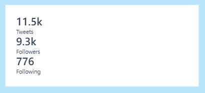
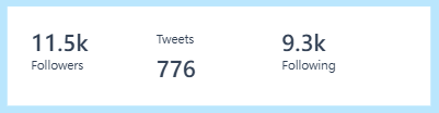
</section>We want to create a 3 X 2 grid. items start getting place one by one filling the first row and then move to second row.
<section class="grid grid-cols-3 grid-rows-2">
<span>11.5k</span>
<p>Tweets</p>
<span>9.3k</span>
<p>Followers</p>
<span>776</span>
<p>Following</p>
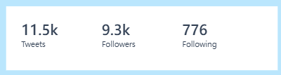
</section>We need to change this defualt flow, to fill the column first instead of row, by adding the grid-flow-col utility class.
<section class="grid grid-flow-col grid-cols-3 grid-rows-2">
  <span>11.5k</span>
  <p>Tweets</p>
  <span>9.3k</span>
  <p>Followers</p>
  <span>776</span>
  <p>Following</p>
</section>
🔍 grid-flow-column
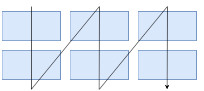
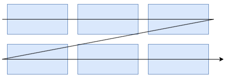
🔍 grid-flow-row (defualt behavior)
🔍 grid-rows-[auto,auto]
grid-rows-[auto,auto] only applies when the grid has exactly two rows. If more rows are needed, extend the list: so grid-rows-[auto,auto,auto] mean three rows.
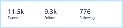
<section class="grid  grid-rows-[auto,auto] grid-flow-col">
  <span>11.5k</span>
  <p>Tweets</p>
  <span>9.3k</span>
  <p>Followers</p>
  <span>776</span>
  <p>Following</p>
</section>🔍justify-self-*
use justify-self-end utility to make image align the most right.
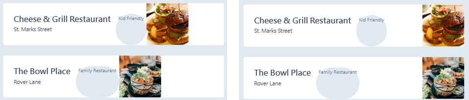
🔍self-start
the label streches full height by default, to prevent that, use self-start utility.
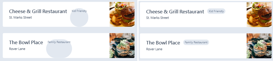
<div class="container grid grid-cols-[auto,auto,1fr]">
  <div class="info">
    <h3>Cheese & Grill Restaurant</h3>
    <span>St. Marks Street</span>
  </div>
  <span class="label self-start">Kid Friendly</span>
  <img  class="justify-self-end"  src="https://images.pexels.com/photos/5745991/pexels-photo-5745991.jpeg?auto=compress&cs=tinysrgb&dpr=2&h=200" alt="">
</div>
<div class="container grid grid-cols-[auto,auto,1fr]">
  <div class="info">
    <h3>The Bowl Place</h3>
    <span>Rover Lane</span>
  </div>
  <span class="label self-start">Family Restaurant</span>
  <img  class="justify-self-end" src="https://images.pexels.com/photos/2781537/pexels-photo-2781537.jpeg?auto=compress&cs=tinysrgb&dpr=2&w=200" alt="">
</div>
🔍Overlay text on image

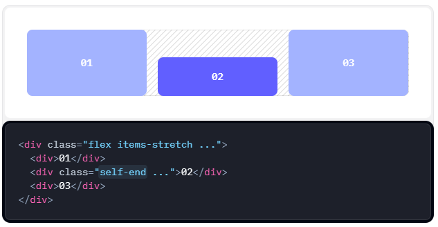
<figure class="grid">
  <img class="col-start-1 col-end-2 row-start-1 row-end-2" src="https://picsum.photos/600/400" alt="">
  <figcaption class="col-start-1 col-end-2 row-start-1 row-end-2 self-end">This is a long caption flowing into two lines or more.</figcaption>
</figure>
You can see the red and blue boxes in the picture below, which represent the positions of the image and text respectively.
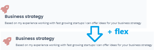
 <div class="service flex">
    <i class="fas fa-rocket"></i>
    <div class="service-body">
      <h5>Business strategy</h5>
      <p>Based on my experience working with fast growing startups I can offer ideas for your business strategy</p>
    </div>
  </div>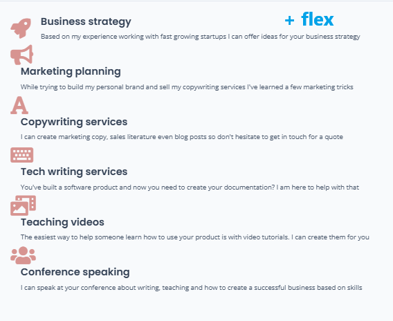

<section class="grid grid-rows-6 sm:grid-rows-3 grid-flow-col gap-10">
  <div class="service flex">
    <i class="fas fa-rocket"></i>
    <div class="service-body">
      <h5>Business strategy</h5>
      <p>Based on my experience working with fast growing startups I can offer ideas for your business strategy</p>
    </div>
  </div>
  <div class="service flex">
    <i class="fas fa-bullhorn"></i>
    <div class="service-body">
      <h5>Marketing planning</h5>
      <p>While trying to build my personal brand and sell my copywriting services I've learned a few marketing tricks</p>
    </div>
  </div>
  <div class="service flex">
    <i class="fas fa-font"></i>
    <div class="service-body">
      <h5>Copywriting services</h5>
      <p>I can create marketing copy, sales literature even blog posts so don't hesitate to get in touch for a quote</p>
    </div>
  </div>
  <div class="service flex">
    <i class="fas fa-keyboard"></i>
    <div class="service-body">
      <h5>Tech writing services</h5>
      <p>You've built a software product and now you need to create your documentation? I am here to help with that</p>
    </div>
  </div>
  <div class="service flex">
    <i class="fas fa-photo-video"></i>
    <div class="service-body">
      <h5>Teaching videos</h5>
      <p>The easiest way to help someone learn how to use your product is with video tutorials. I can create them for you</p>
    </div>
  </div>
  <div class="service flex">
    <i class="fas fa-users"></i>
    <div class="service-body">
      <h5>Conference speaking</h5>
      <p>I can speak at your conference about writing, teaching and how to create a successful business based on skills</p>
    </div>
  </div>
</section>