block-level elements:<div>, <p>, <h1>-<h6>, <section>, <article>
inline-level elements:<span>, <a>, <strong>, <em>
block-level elements: one below other block-level elements (default)
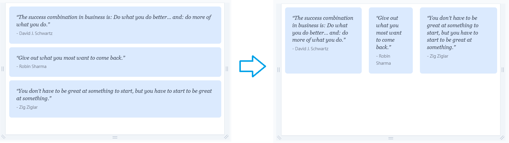
<div> <div class="quote">...</div> <div class="quote">...</div> <div class="quote">...</div> </div> | <div class="flex"> <div class="quote">...</div> <div class="quote">...</div> <div class="quote">...</div> </div> |
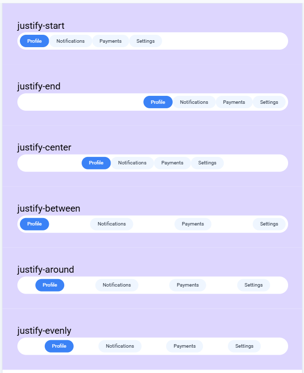
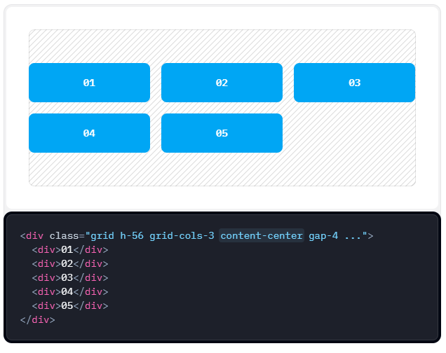
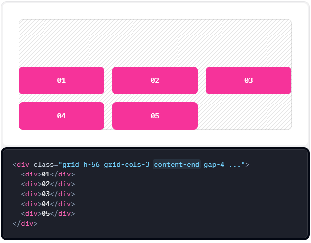
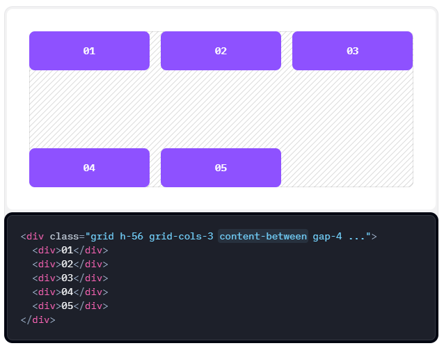
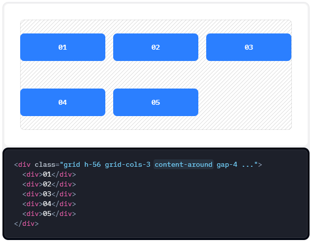
| Tailwind class | Explanation |
| justify-start | All items are placed at the beginning of the container with no spaces |
| justify-end | All items are placed at the end of the container with no spaces |
| justify-center | All items are placed at the center with no spaces |
| justify-between | All items are spaced out as much as possiblewith first item at the beginning and last item at the end (We just saw this in action) |
| justify-around | Space before the flex items and after the flex items are half as much as space between the items |
| justify-evenly | Space before, after and between the items are same |
<div class="wrapper">
  <div class="menu flex justify-start">...</div>
</div>
<div class="wrapper">
  <div class="menu flex justify-end">...</div>
</div>
<div class="wrapper">
  <div class="menu flex justify-center">...</div>
</div>
<div class="wrapper">
  <div class="menu flex justify-between">...</div>
</div>
<div class="wrapper">
  <div class="menu flex justify-around">...</div>
</div>
<div class="wrapper">
  <div class="menu flex justify-evenly">...</div>
</div>
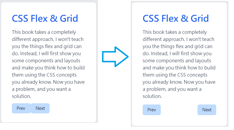
<div class="card"> | <div class="card"> |
<div class="container"> | <div class="container flex"> |

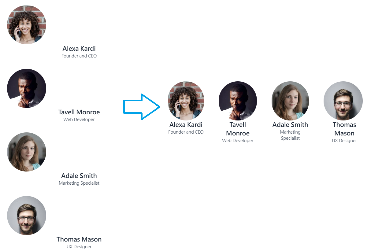
<div class="container flex justify-around flex-wrap">
  <div class="team-profile">
    ...
  </div>
  <div class="team-profile">
    ...
  </div>
  <div class="team-profile">
    ...
  </div>
  <div class="team-profile">
    ...
  </div>
</div>
<div class="wrapper">
  <h2>Top Clients</h2>
  <div class="logos flex justify-around flex-wrap">
    ...
  </div>
</div>

<div class=""> | <div class="flex"> | <div class="flex items-center"> |

<div class="icon-wrap flex items-center">
  <span class="icon">...</span>
  <span class="icon-text">...</span>
</div>

| Tailwind Class | Explanation |
| items-stretch | All items are stretched to fill the container |
| items-center | All items are aligned to the center of the container |
| items-start | All items are aligned to the beginning of the container |
| items-end | All items are aligned to the end of the container |
| items-baseline | All items are positioned such that the base aligns to the end of the container |
@tailwind base; | <div class="wrapper"> |

@tailwind base; | <div class="profile flex items-center">…" alt="" /> |
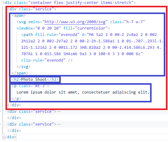
There are three block elements in the blue area will be one below other block-level elements (default).There are three serive divs in the red area will follow the ** flex justify-center items-stretch** rule.
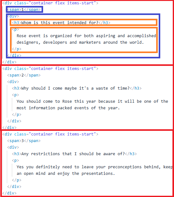
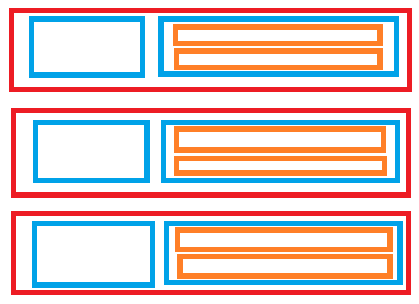
Each Red Block will be one below other block-level elements. There children elements in the red block are flex (blue area), the orange block will be one below other block-level elements.
The following two ways of writing can achieve this effect
<div class="w-full h-screen flex flex-col justify-center"> | <div class=”w-full h-screen flex”> <div class=”item m-auto“> I’m at the center of this page </div> </div> |
The justify-* control spacing and aligment along the main axis, while the item-* control alignment along the cross axis. So that this example we use flex-col justify-center.
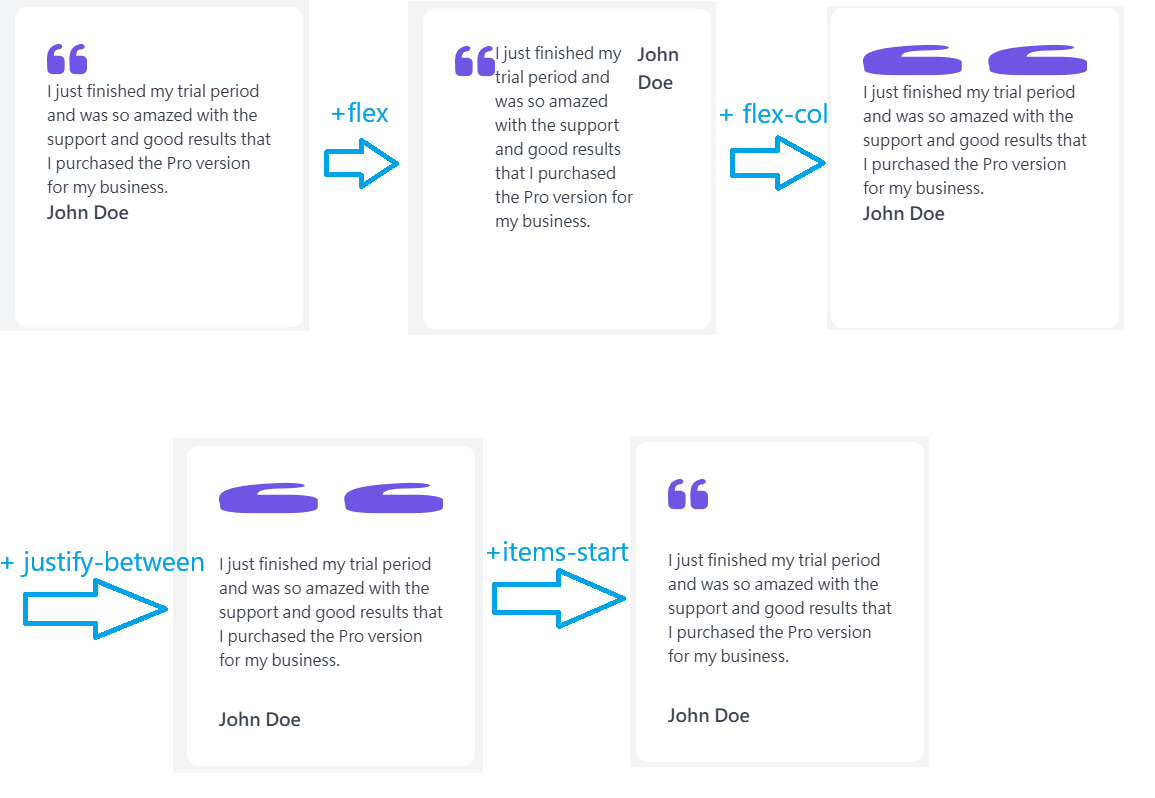
<div class="card flex flex-col justify-between items-start">
<img src="https://res.cloudinary.com/thirus/image/upload/v1629308145/logos/quote-left_tsopjj_zviayy.svg" alt="">
<p>
I just finished my trial period and was so amazed with the support and good results that I purchased the Pro version for my business.
</p>
<span>John Doe</span>
</div>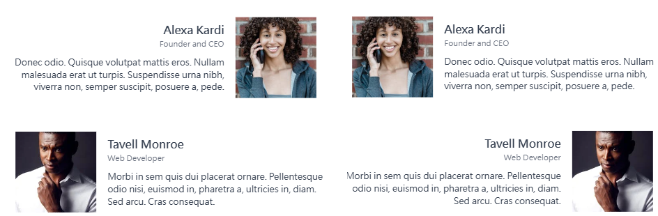
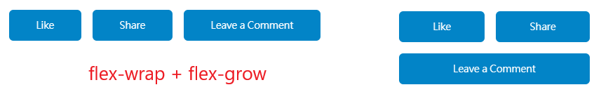
<div class="wrapper"> | <div class="wrapper"> |
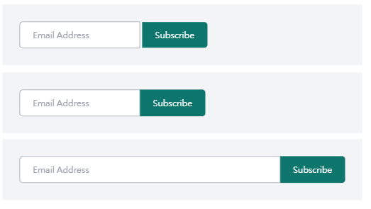
<div class="wrapper">
<div class="container flex">
<input type="email" class="flex-grow" placeholder="Email Address">
<button type="submit">Subscribe</button>
</div>
</div>The second picture: +flex, the third picture: +flex-grow, the flow-grow will make the item grows to occupy remaining space alog the main axis.
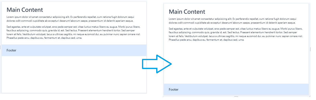
If your element needs to fill the entire screen independently, use min-h-screen.
<div class="container flex min-h-screen flex-col">
<div class="main flex-grow">
<h1>Main Content</h1>
<p>Lorem ipsum dolor sit amet consectetur adipisicing elit. Ex perferendis repellat, cum ratione fugit dolorum sequi dolores odit commodi cupiditate ab excepturi deserunt laborum saepe, praesentium id deleniti aperiam eaque.</p>
<p>Sed egestas, ante et vulputate volutpat, eros pede semper est, vitae luctus metus libero eu augue. Morbi purus libero, faucibus adipiscing, commodo quis, gravida id, est. Sed lectus. Praesent elementum hendrerit tortor. Sed semper lorem at felis. Vestibulum volutpat, lacus a ultrices sagittis, mi neque euismod dui, eu pulvinar nunc sapien ornare nisl. Phasellus pede arcu, dapibus eu, fermentum et, dapibus sed, urna.</p>
</div>
<footer>
<h3>Footer</h3>
</footer>
</div>
@tailwind base;
@tailwind components;
@tailwind utilities;
@layer base {
body {
@apply bg-gray-200 text-gray-700;
}
}
@layer components {
p {
@apply text-center my-8;
}
ul {
@apply bg-white my-8 mx-auto;
width: 44rem;
}
ul li {
@apply p-5 text-center cursor-pointer
transition-all duration-200 border-b-2 border-white
hover:border-green-400
}
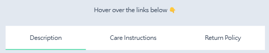
}<p>Hover over the links below 👇</p>
<ul class="flex">
<li class="flex-grow">Description</li>
<li class="flex-grow">Care Instructions</li>
<li class="flex-grow">Return Policy</li>
</ul>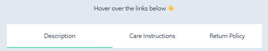
This Tailwind CSS code makes the elements inside the flex-grow and triple in size on hover.
<p>Hover over the links below 👇</p>
<ul class="flex">
<li class="flex-grow hover:flex-grow-[3]">Description</li>
<li class="flex-grow hover:flex-grow-[3]">Care Instructions</li>
<li class="flex-grow hover:flex-grow-[3]">Return Policy</li>
</ul>
@tailwind base; | <div class="container flex flex-wrap"> |

<div class="container flex items-start">
<div>
<h2>Visit to the Eiffel Tower</h2>
<p>There's no better start to your Paris tour than visiting the iconic Eiffel Tower. This is a must visit tourist spot in the whole of France.</p>
</div>
<span class="flex-shrink-0">10:00 AM</span>
</div>
<div class="container flex items-start">
<div>
<h2>Lunch at New Jawad</h2>
<p>It is an Indian restaurant close to the Eiffel Tower. Enjoy delicious Indian traditional food and South Asian food.</p>
</div>
<span>1:00 PM</span>
</div>
In the first .container (the Visit to the Eiffel Tower block):
The span has flex-shrink-0 so it won’t shrink, even if there’s not enough space it will still stay the same size.
In the second .container (the Lunch at New Jawad block):
The span doesn’t have flex-shrink-0, so when there’s not enough space, it may shrink to fit the available space.
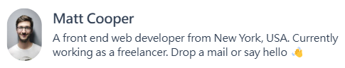

<div class="profile flex items-center">
<img src="https://images.pexels.com/photos/220453/pexels-photo-220453.jpeg?auto=compress&cs=tinysrgb&dpr=2&w=80" alt="" class="flex-shrink-0 profile-img" />
<div>
<h3>Matt Cooper</h3>
<p>A front end web developer from New York, USA. Currently working as a freelancer. Drop a mail or say hello 👋</p>
</div>
</div>

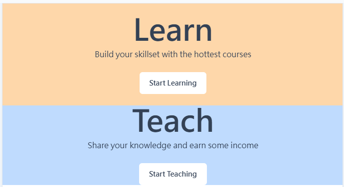
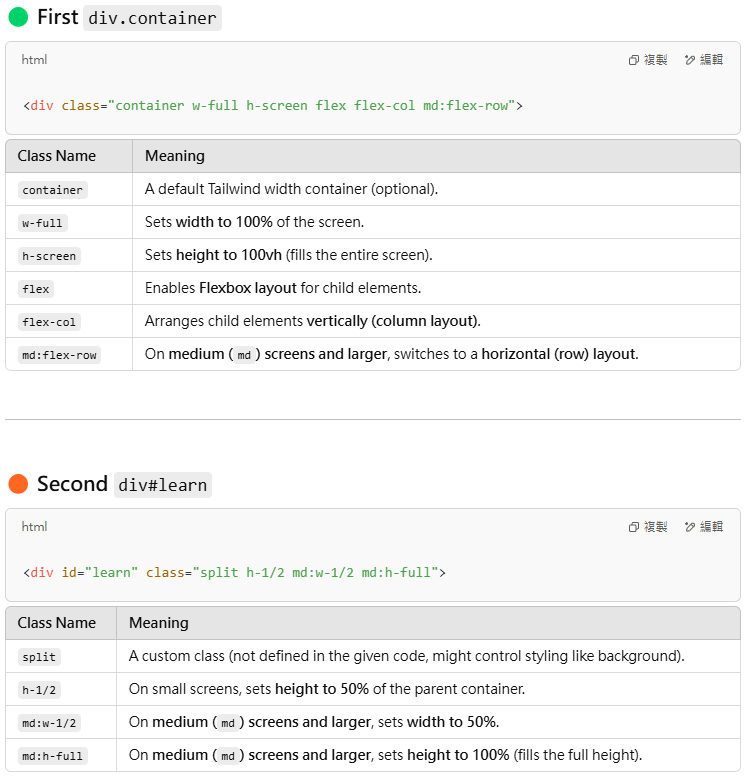
<div class="container w-full h-screen flex flex-col md:flex-row">
<div id="learn" class="split h-1/2 md:w-1/2 md:h-full">
<div>
<h1>Learn</h1>
<p>Build your skillset with the hottest courses</p>
<a href="#">Start Learning</a>
</div>
</div>
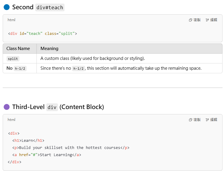
<div id="teach" class="split">
<div>
<h1>Teach</h1>
<p>Share your knowledge and earn some income</p>
<a href="#">Start Teaching</a>
</div>
</div>
</div>
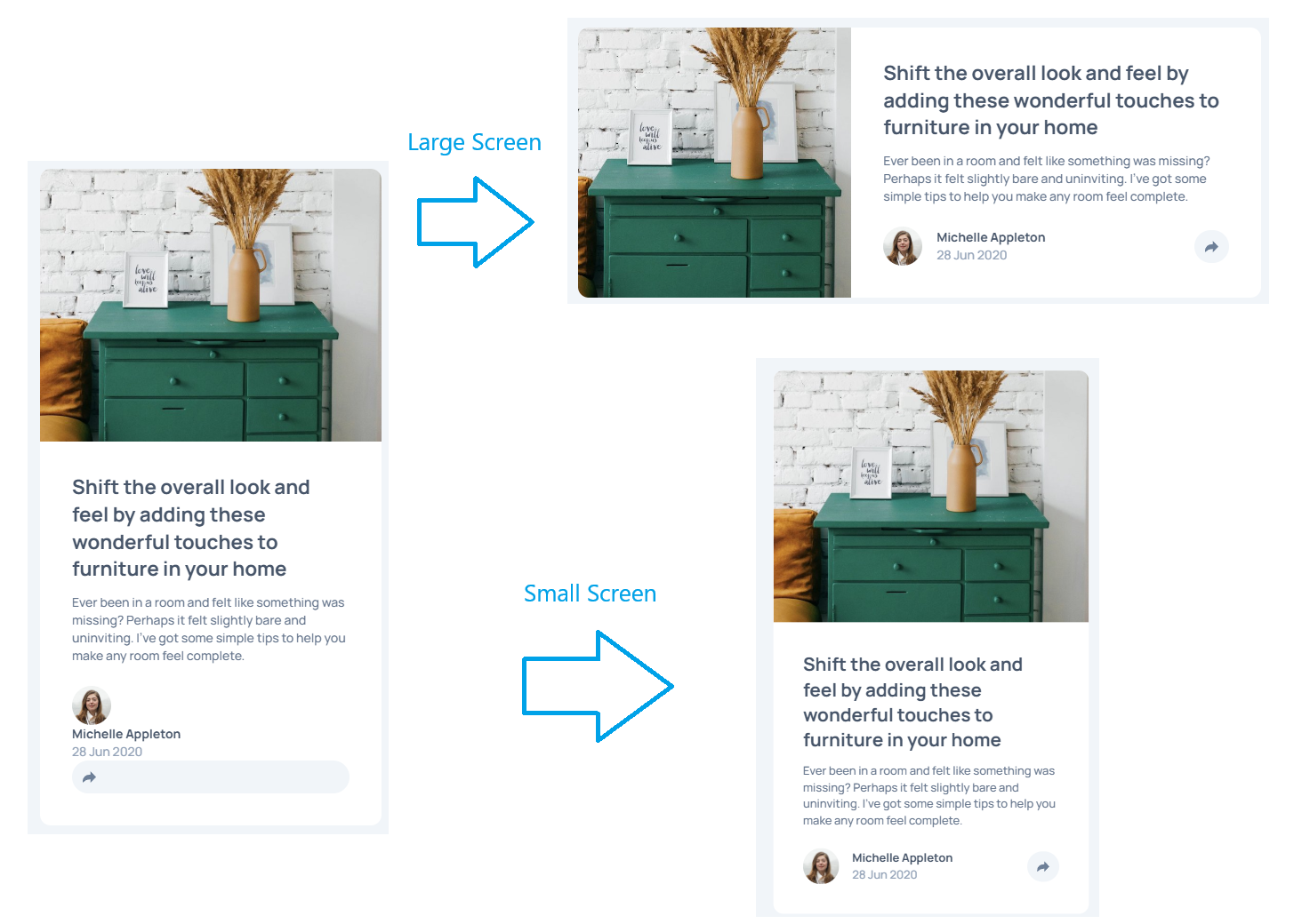
This code creates a full-screen-height double-column (or double-row) block that is displayed top-to-bottom on small screens and left-to-right on large screens, depending on the screen size.

mx-4 control the horizontal margin of an element, basis-1/3 set the initial size of flex items to be 1/3 parent width.
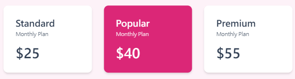
<div class="wrapper">
  <div class="container flex">
    <div class="plan mx-4 basis-1/3">
      <h2>Standard</h2>
      <span>Monthly Plan</span>
      <p>$25</p>
    </div>
    <div class="plan plan-highlight mx-4 basis-1/3">
      <h2>Popular</h2>
      <span>Monthly Plan</span>
      <p>$40</p>
    </div>
    <div class="plan mx-4 basis-1/3">
      <h2>Premium</h2>
      <span>Monthly Plan</span>
      <p>$55</p>
    </div>
  </div>
</div>
basis-0 flex-grow: Let the element share the remaining space equally;
<div class="wrapper">
  <div class="container flex">
    <div class="plan mx-4 basis-0 flex-grow flex-shrink">
      <h2>Standard</h2>
      <span>Monthly Plan</span>
      <p>$25</p>
    </div>
    <div class="plan plan-highlight mx-4 basis-0 flex-grow flex-shrink">
      <h2>Popular</h2>
      <span>Monthly Plan</span>
      <p>$40</p>
    </div>
    <div class="plan mx-4 basis-0 flex-grow flex-shrink">
      <h2>Premium</h2>
      <span>Monthly Plan</span>
      <p>$55</p>
    </div>
  </div>
</div>
we can use the flex-* shorthand utility. to replace all those three css classes with a single class.
<div class="wrapper">
  <div class="container flex">
    <div class="plan mx-4 flex-1">
      <h2>Standard</h2>
      <span>Monthly Plan</span>
      <p>$25</p>
    </div>
    <div class="plan plan-highlight mx-4 flex-1">
      <h2>Popular</h2>
      <span>Monthly Plan</span>
      <p>$40</p>
    </div>
    <div class="plan mx-4 flex-1">
      <h2>Premium</h2>
      <span>Monthly Plan</span>
      <p>$55</p>
    </div>
  </div>
</div>
| Tailwind Class | CSS Property & Value | Explanation |
| flex-1 | flex: 1 1 0%; | Flex item grows and shrinks as needed ignoring the initial size. If this is used on multiple items, all the items take up equal space. |
| flex-auto | flex: 1 1 auto; | Flex item grows and shrinks as needed considering the initial size . If this is used on multiple items, all the items take up space based on their content. |
| flex-initial | flex: 0 1 auto; | This is the default. The item shrinks when space is less but does not grow when there’s space available. Initial size is auto-calculated. |
| flex-none | flex: none; | The item does not grow, nor shrink. |
| Synax flex: <flex-grow> <flex-shrink> <flex-basis>, the values must be in the following order: 1. a <number>for flex-grow 2. a <number> for flex-shrink 3. a <number with units> for flex-basis fex: 1 1 0%; flow-grow + flow-shrink + basis-0 flex: 1 1 auto; flow-grow + flow-shrink + basis-auto flex: 0 1 auto; flow-grow-0 + flow-shrink + basis-auto flex none: flow-grow-0 + flow-shrink-0 + basis-auto |


<footer class="flex">
  <div class="footer-col">
    <img src="https://res.cloudinary.com/thirus/image/upload/v1628614672/logos/circleai_dm9slt.png" alt="Circle AI Logo" height="30" />
    <p>The Company Tagline</p>
  </div>
  <div class="footer-col ml-auto">
    <h3>Quick Links</h3>
    <ul>
      <li></li>
      <li></li>
      <li></li>
      <li></li>
    </ul>
  </div>
  <div class="footer-col">
    <h3>Contact Us</h3>
    <ul>
      <li></li>
      <li></li>
    </ul>
  </div>
  <div class="footer-col">
    <h3>Social</h3>
    <ul>
      <li></li>
      <li></li>
      <li></li>
    </ul>
  </div>
</footer>


<header class="flex flex-wrap justify-between items-center">
  <a href="#" class="flex-1">
    <img class="inline h-7" src="https://res.cloudinary.com/thirus/image/upload/v1628614672/logos/circleai_dm9slt.png" alt="" />
  </a>
  <ul class="order-last flex-[100%] mt-4 md:order-none md:flex-auto md:mt-0">
    <li>
      <a href="#">Home</a>
    </li>
    <li>
      <a href="#">About Us</a>
    </li>
    <li>
      <a href="#">Pricing</a>
    </li>
  </ul>
  <span class="flex-1 text-right">
    <a href="#" class="btn">Join us</a>
  </span>
</header>
- small screen
- order-last //ul will be placed at the end of the header, so the logo and “Join us” appear first, and the navigation menu is at the end.
- flex-[100%] //flex-[100%] makes ul occupy the entire line (block level display)
- mt-4
- large screen
- order-none
- flex-auto // Let ul adjust its width according to the content size in flex layout
- mt-0
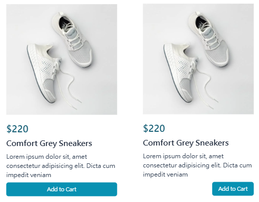
<div class="container flex flex-col">
  <img src="https://images.pexels.com/photos/1464625/pexels-photo-1464625.jpeg?auto=compress&cs=tinysrgb&dpr=2&h=300" alt="" />
  <span>$220</span>
  <h3>Comfort Grey Sneakers</h3>
  <p>Lorem ipsum dolor sit, amet consectetur adipisicing elit. Dicta cum impedit veniam</p>
  <button class="self-end">Add to Cart</button>
</div>
Align-self utilities for controlling how an individual flex or grid item is positioned along its container’s cross axis. Because we use flex-col so the main axis is upside-down, cross axis is left-to-right. so the self-end will make the button align right.
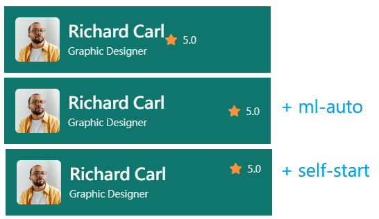
<div class="container flex items-center">
  <img src="https://images.pexels.com/photos/7562313/pexels-photo-7562313.jpeg?auto=compress&cs=tinysrgb&dpr=2&h=100" alt="">
  <div>
    <p>Richard Carl</p>
    <span>Graphic Designer</span>
  </div>
  <div class="rating ml-auto self-start">
    <i class="fa fa-star"></i>
    <span>5.0</span>
  </div>
</div>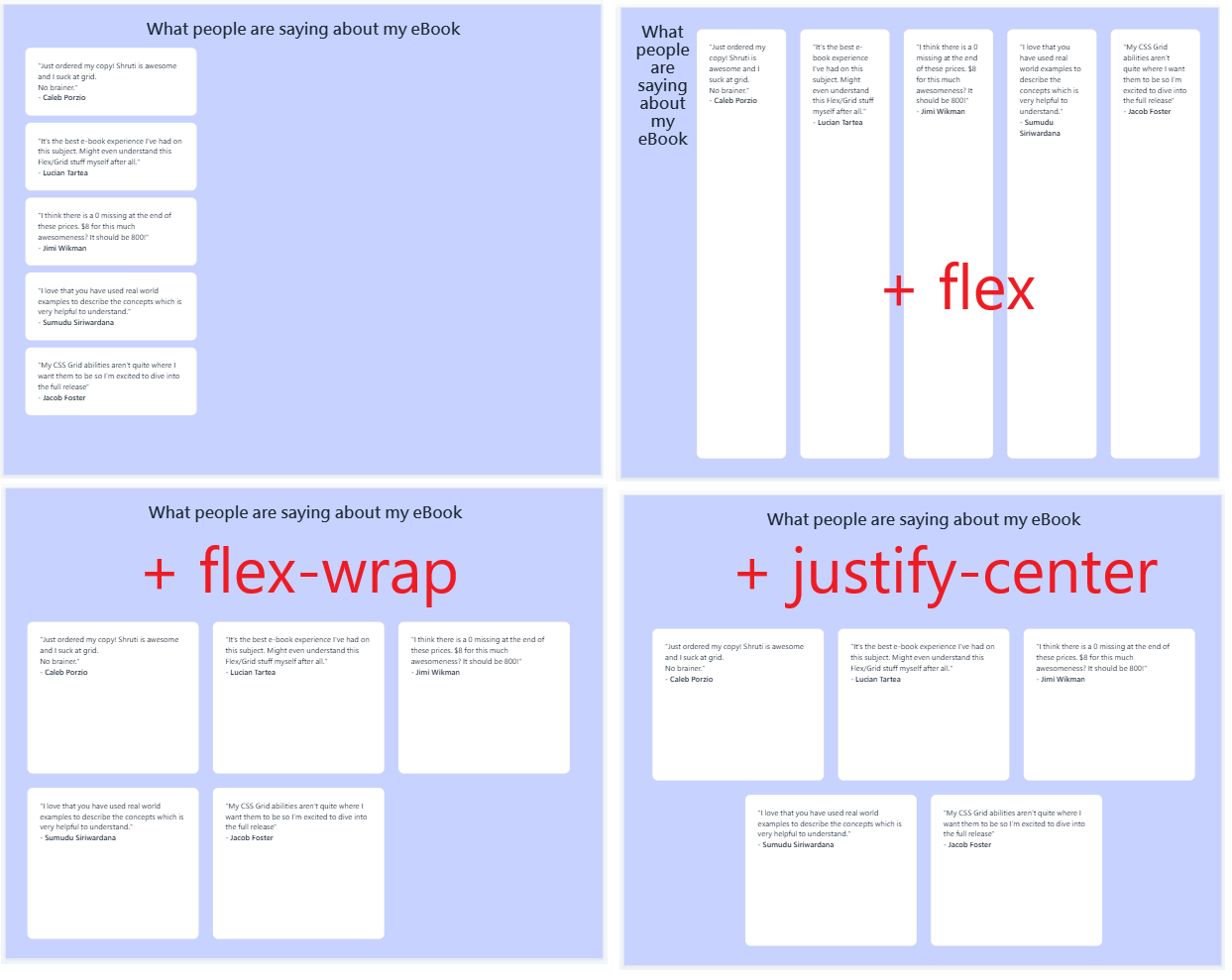
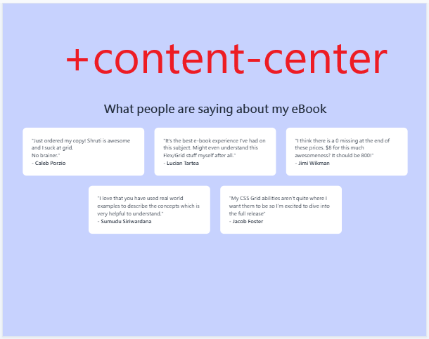
<div class="container flex flex-wrap justify-center content-center">
  <h1 class="flex-full text-center">What people are saying about my eBook</h1>
  <div class="testimonial">
    <p>"Just ordered my copy! Shruti is awesome and I suck at grid.<br />No brainer."</p>
    <span><strong>- Caleb Porzio</strong></span>
  </div>
  <div class="testimonial">
    <p>"It's the best e-book experience I've had on this subject. Might even understand this Flex/Grid stuff myself after all."</p>
    <span><strong>- Lucian Tartea</strong></span>
  </div>
  <div class="testimonial">
    <p>"I think there is a 0 missing at the end of these prices. $8 for this much awesomeness? It should be 800!"</p>
    <span><strong>- Jimi Wikman</strong></span>
  </div>
  <div class="testimonial">
    <p>"I love that you have used real world examples to describe the concepts which is very helpful to understand."</p>
    <span><strong>- Sumudu Siriwardana</strong></span>
  </div>
  <div class="testimonial">
    <p>"My CSS Grid abilities aren’t quite where I want them to be so I’m excited to dive into the full release"</p>
    <span><strong>- Jacob Foster</strong></span>
  </div>
</div>
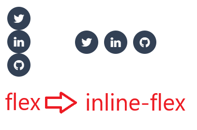
<a class="icon inline-flex justify-center items-center" href="#">
  <i class="fa fa-twitter"></i>
</a>
<a class="icon inline-flex justify-center items-center" href="#">
  <i class="fa fa-linkedin"></i>
</a>
<a class="icon inline-flex justify-center items-center" href="#">
  <i class="fa fa-github"></i>
</a>
But the utility inline-flex does not affect the flex items.
It makes the flex container itself behave like an inline element instead of a block
element
<div class="wrapper">
  <div class="container flex flex-col md:flex-row">
    <div class="flex-[40%]">
      <img class="article-img" src="https://res.cloudinary.com/thirus/image/upload/v1632854291/logos/drawers_gr2wn5.jpg" alt="Furniture" />
    </div>
    <div class="details flex-[60%]">
      <h2>Shift the overall look and feel by adding these wonderful touches to furniture in your home</h2>
      <p>Ever been in a room and felt like something was missing? Perhaps it felt slightly bare and uninviting. I've got some simple tips to help you make any room feel complete.</p>
      <div class="article-footer flex items-center">
        <img src="https://res.cloudinary.com/thirus/image/upload/v1632854290/logos/avatar-michelle_qcobnu.jpg" alt="" />
        <div>
          <p>Michelle Appleton</p>
          <span>28 Jun 2020</span>
        </div>
        <div class="share-icon ml-auto">
          <img src="https://res.cloudinary.com/thirus/image/upload/v1632854290/logos/icon-share_frvrfu.svg" alt="" />
        </div>
      </div>
    </div>
  </div>
</div>
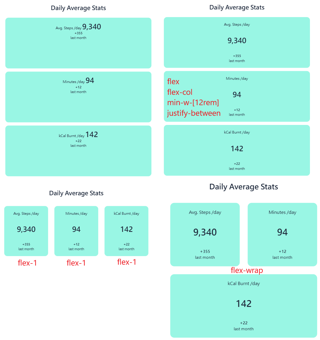
<h1>Daily Average Stats</h1>
<div class="container flex flex-wrap">
  <div class="report flex-1 flex flex-col min-w-[12rem] justify-between">
    <span>Avg. Steps /day</span>
    <span>9,340</span>
    <div>
      <p><strong>+355</strong></p>
      <span>last month</span>
    </div>
  </div>
  <div class="report flex-1 flex flex-col min-w-[12rem] justify-between">
    <span>Minutes /day</span>
    <span>94</span>
    <div>
      <p><strong>+12</strong></p>
      <span>last month</span>
    </div>
  </div>
  <div class="report flex-1 flex flex-col min-w-[12rem] justify-between">
    <span>kCal Burnt /day</span>
    <span>142</span>
    <div>
      <p><strong>+22</strong></p>
      <span>last month</span>
    </div>
  </div>
</div>